[practis_cta]
Everyone loves art. Even if you’ve never set foot inside an art museum, you probably have art hanging on your walls. And, hopefully, every time you look at it, that artwork makes you feel something–that’s what art is supposed to do!
So… does your website need to be a work of art? Should you feel compelled to print off your homepage and hang it on your walls at home?
It’s certainly true that a website can be beautiful. But the best audiology websites are also more than that.
A Good Website is Critical to Your Success
For an audiologist, a good website will be critical for your long-term success. Most patients who discover your services will see you online before they ever step foot in your office. Even patients referred to you will likely check you out online first. In most major healthcare verticals, over 60% of patients will run a web search for your practice before scheduling an appointment. A website that doesn’t pass the sniff test–if it looks dated or clunky–will likely mean lost sales.
Over time, that can hurt your practice’s ability to grow. On the other hand, a website that is firing on all cylinders can help bring in more patients. The question is, what does “firing on all cylinders” mean?
Consider it like this: your website is a communication tool. It’s constantly communicating something to patients. A thoughtless website design can share a lot of unintentional information. However, a thoughtful, intentional website design can ensure your brand messaging and company values make an impression.
What’s Important in an Audiology Website?
A website isn’t just a work of art, of course (though plenty of skill goes into its creation). Most websites operate on three distinct principles that guide most decisions through the design and development process:
- Your website should build credibility and trust: If your audiology website looks like it’s from the 1990s, no one will believe you sell high-tech, cutting-edge hearing aids. An outdated design means that patients won’t even give you a chance. For an audiologist, your website design should showcase your expertise and confidence.
- Your website should be easy to use: In industry parlance, this is called the “user experience.” Have you ever come across a beautiful website that is intensely difficult to use? That’s what we want to avoid! So, any good audiology website will be designed with its audience in mind. After all, a website is designed to be helpful. As a result, it should be easy to use.
- Mobile responsive: Every website designed and built today should display one size on desktop and another on mobile. What’s more–these websites should look great and be easy to use on any device.
Trends in Audiology Website Design
Within that basic framework, there’s plenty of space for creativity. That’s how your brand message gets turned into a creative vision! Some of the most popular (and timeless) trends in audiology website design can help ensure your practice is doing everything possible to attract new patients.
Some of those trends include:
Clean and Minimalistic Design
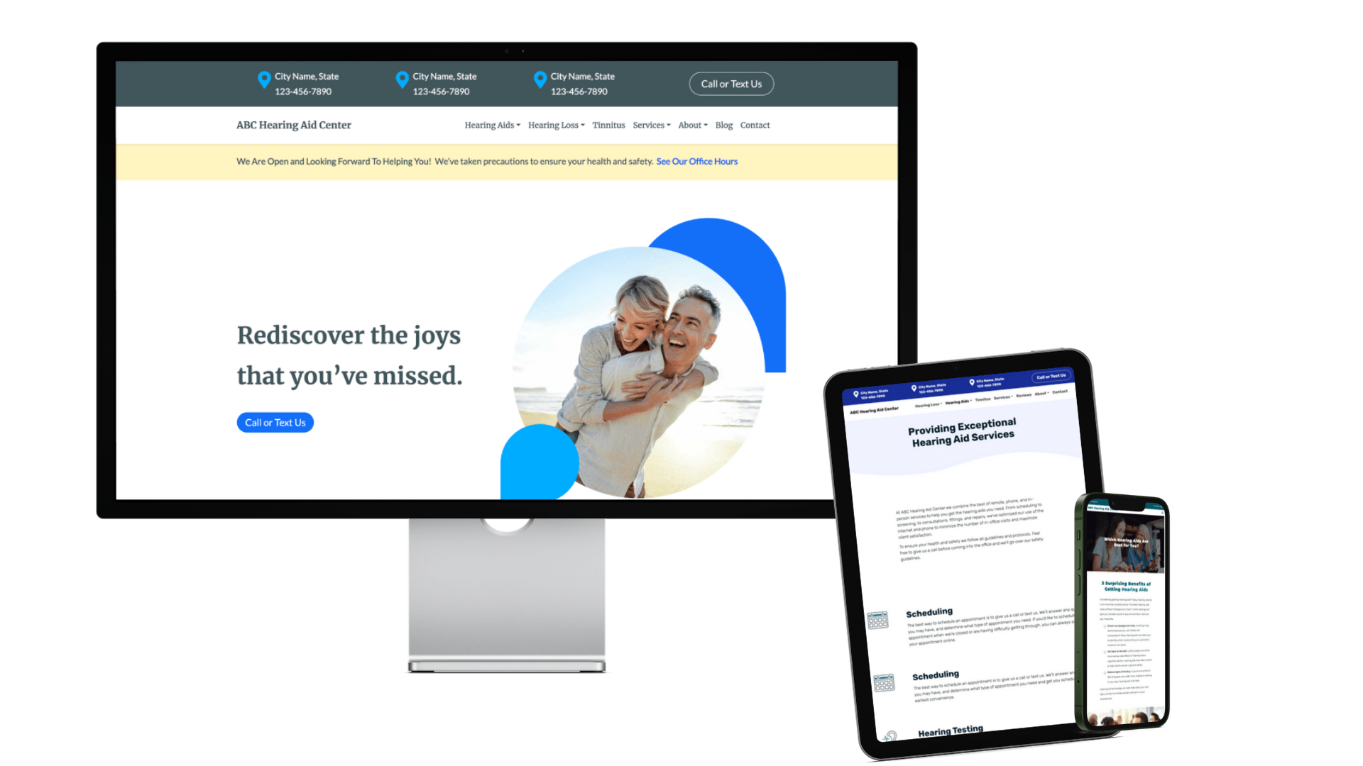
An audiology website should be simple, clean, and easy to look at. You don’t want to overcomplicate things with an elaborate design. That’s why many of today’s best designers incorporate a lot of white space, which helps guide the eye. This will help improve readability and focus (so your audience doesn’t forget why they’re visiting you in the first place). The idea is that you don’t want to get in your way!
User-centric and Intuitive Navigation
Most patients will visit your website because they want answers to their questions. This means that your audiology website will likely contain a lot of information that your patients will want to access easily.
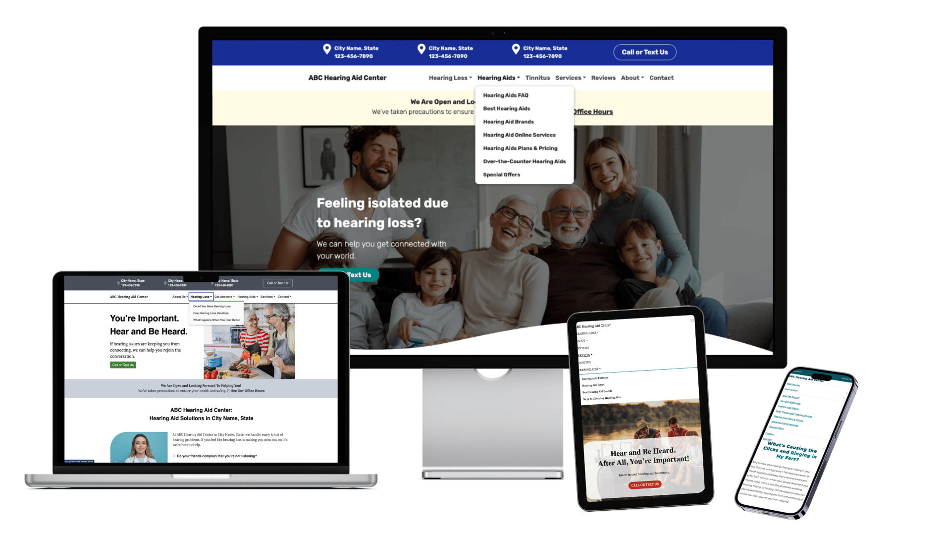
The best web designs will ensure that any information is easy to find and access. This means your website should have intuitive navigation and menu structures. The next step a patient can take should always be clear! If you have a ton of information, then use mega-menus and incorporate search functionality to make the correct information as easy to find as possible.
Engaging Visuals and Imagery
Just because the trend is to keep things simple and minimalistic doesn’t mean your audiology website design should be boring.
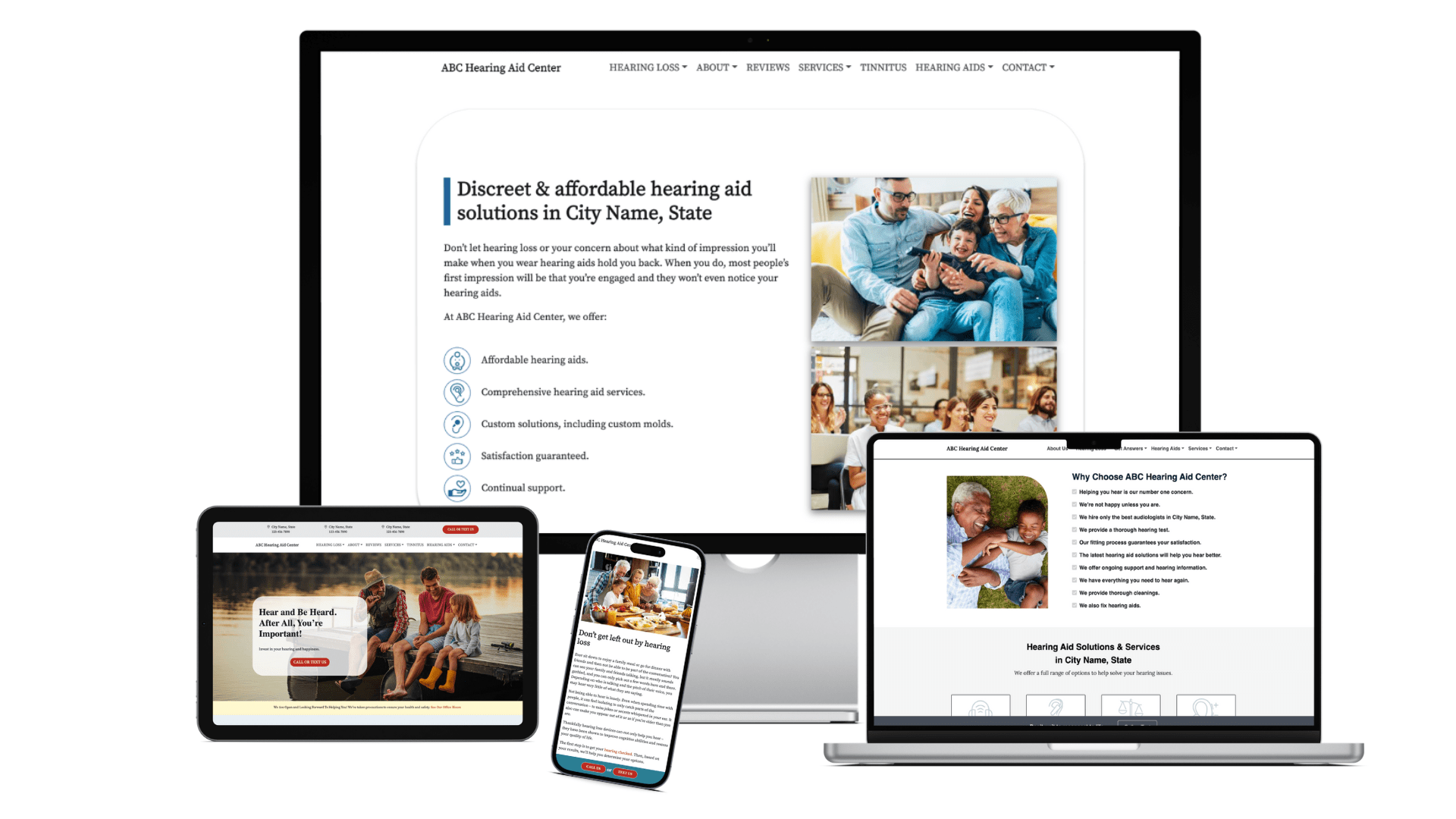
Most modern website designs will now feature high-quality images (and maybe even some videos) to enhance user engagement. Illustrations and infographics can convey complex information to your users in an easy-to-understand way, and building an authentic and interesting visual language can help you communicate your brand values to your patients. Your website needs to stand out–and it needs to engage the eye.
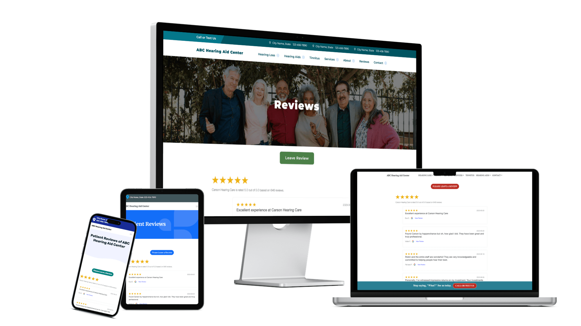
Patient Testimonials and Success Stories
Testimonials are a great way to trumpet your own success. In fact, 90% of all patients look at doctor reviews before (it’s a marketing concept known as social proof, and it’s remarkably effective at encouraging new patients).
Reviews and testimonials work even better when designed into your website from the ground up. That way, your website can effectively accommodate and highlight great reviews. The more great reviews you have, the more you’ll be able to build trust and credibility. Many websites will even build in review collection mechanisms so that patients can share their stories more easily!
Getting Patients into Their Appointments Faster
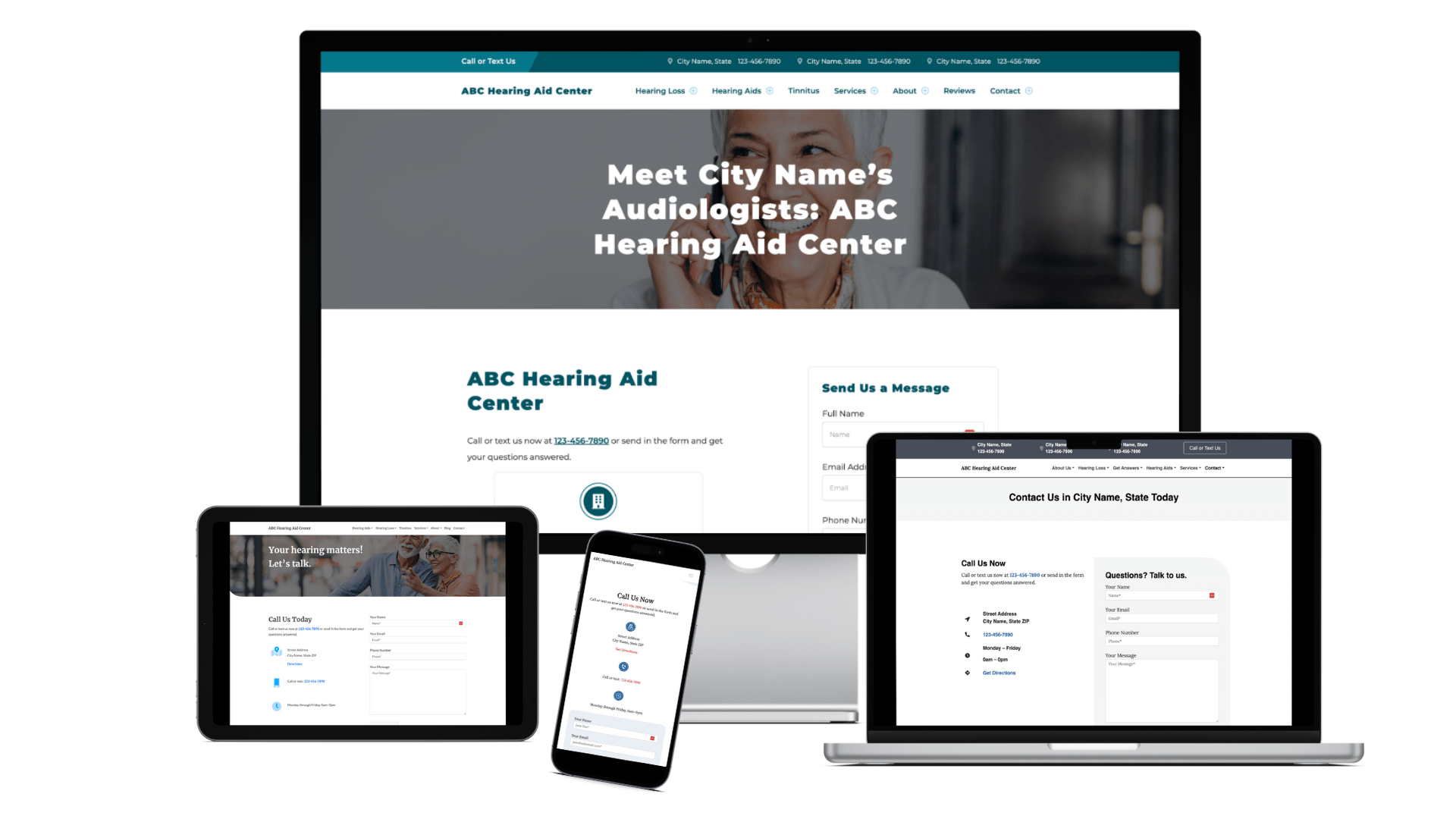
Ah, the contact form. It’s the easiest way to encourage patients to schedule an appointment with you. Many modern audiology websites have all that appointment setting built right in. (The easier it is to make an appointment, the more patients you’ll likely see.) This is a process called onboarding–and when your website engages in this process, it’s essential that you are HIPAA compliant, just like all MedPB websites are. This means that the best audiology website designs always comply with HIPAA–so they can keep your practice safe.
Embracing Responsive Design
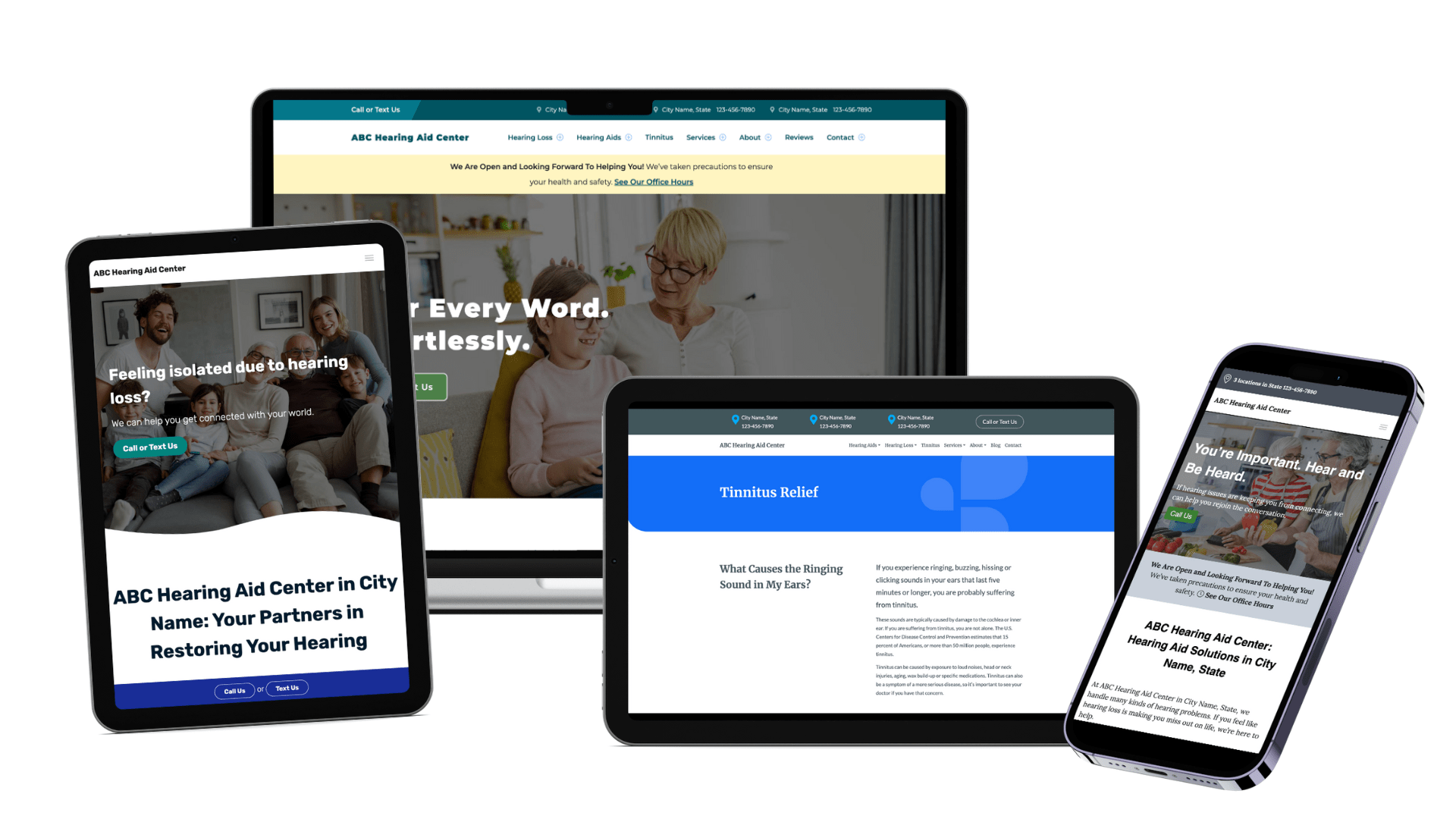
Look, it’s 2023. Every website needs to be responsive. Over half of website traffic comes from mobile devices. Modern websites must ensure a seamless experience, regardless of device or screen size. This can help your on-site metrics and your search engine performance. (Websites that are not responsive do not rank well on Google.) Every MedPB website is designed to look and work great in both desktop and mobile sizes.
Accessibility and Inclusive Design
Only some people who use your website will have the same capabilities. As a result, it’s essential to think about accessibility and inclusivity when you design a website. Creating an experience that’s good for all visitors is suitable for everyone. That’s why websites should include features such as alt-text on images and a navigation menu that’s easy to tab through for screen readers, for example. (And that’s just for starters.) The goal is to make your website as accessible and inclusive as possible.

Does Good Website Design Make a Difference?
If you aren’t a web designer and developer (or a marketing agency), you might look at this list and feel pretty overwhelmed. After all, there’s a lot that goes into designing an audiology website. That’s okay–that’s what we’re here for.
So… does all that work make a difference? It definitely does. See for yourself:
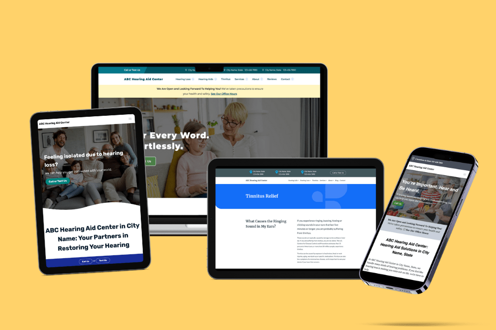
Check out these examples from MedPB’s own clients.
For Most Patients, Your Website is a Lot Like Your Front Door
Suppose your website follows audiology design best practices. In that case, you’ll be able to welcome in new patients, answer their questions, and help them get to the next stage of their journey (hopefully, purchasing some hearing aids).
But it’s important to remember that website design is constantly changing. (Even if you were to put your homepage in a frame and hang it on your wall–it could be outdated in a few years.) So you don’t want to rest on your laurels.
After all, it’s all about your patients (today’s and tomorrow’s) and making them happy!
[practis_cta]

