Worldwide, the healthcare data analytics market is expected to be worth nearly $50 billion by 2024. That’s a lot of data analysis, and with good reason – it’s no secret that data drive smart decisions. And yet, we see all too often that the resulting analyses fall short of telling healthcare leaders what they really need to know.
Tables and spreadsheets have their limits – all the information is there, and it looks tidy enough, but finding the so-what amid a sea of rows and columns that extend far beyond your screen is challenging. If we keep important insights locked in cells, they don’t tell stories, so they don’t provide much value. Data visualization, on the other hand, is an excellent way to bring data to life. It heightens your ability to recognize patterns and opportunities that may otherwise get lost in the haystack.
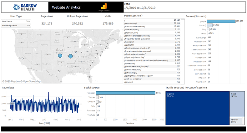
While we long ago mastered Google Analytics and Adobe Analytics for informing web and digital marketing strategies, we use Tableau to provide custom dashboards and other data visualization tools that inform better business decisions.

“By integrating data from multiple sources and synthesizing insights into easy-to-follow visuals, we illuminate growth and new business development opportunities for our clients.”
— Jordan Kloewer, Health Data Analyst
Dashboard Analytics
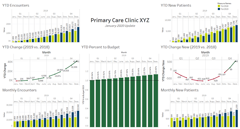
Primary care is a leading indicator of market share growth in a health system, so it is important to quickly identify utilization trends by location and by service line. With dashboard analytics, it’s easier to see patterns that may predict growth or decline in new versus established patient volume – valuable information for deciding where to focus marketing efforts to meet goals, streamline operations, enhance access, or potentially transfer marketing dollars to new service lines based on volume and capacity.

[bctt tweet=”Data visualization identifies trends that direct data-driven marketing decisions.” username=”DobiesGroup”]
Visual Mapping
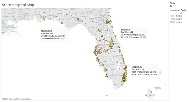
When assessing market share at the service line level, interactive charts provide the ability to add filters and legends for competitive profiling purposes. Tableau also allows for advanced visual mapping functionalities. These maps quickly plot, geographically and by volume, where competitors are located compared to other clinics, hospitals and organizations. While you may intuitively understand the competitive landscape, this tool is useful in gaining additional insight about growth opportunities in market.
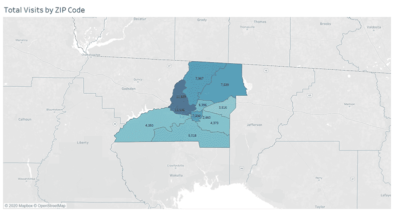
Visual mapping indicates where patients originate, informing highly targeted marketing tactics to be deployed in those markets. Additionally, as a strategic planning tool, visual mapping can assist in planning for new facilities, ambulatory/outreach services, provider recruitment or service area expansion.


[bctt tweet=”Visual mapping provides a unique view of the competitive landscape.” username=”DobiesGroup”]
With the continued emphasis on data in healthcare, it’s important to optimize return on investment by making sure the data points you gather, in the end, will come together to paint a meaningful picture. Through platforms like Tableau, Google Analytics and Adobe Analytics and others – coupled with deep dives by our skilled strategists and health data analysts – our clients are seeing their market landscapes more clearly and making more informed market decisions.
For more information about market data and analytics for healthcare organizations, visit dobies.com/data.
About the Author
 Carol Dobies, MBA, is the CEO and Founder of Dobies Health Marketing, where she has been bringing healthcare brands to life for 35+ years. Share your thoughts with her by tweeting @DobiesGroup, connecting with us on LinkedIn, or by commenting on our Facebook page.

